【笔记】搭建一个AI对话机器人——前端ChatUI使用纪录
Apr 22, 2023笔记工具ai
搭建一个 AI 对话机器人——前端 ChatUI 使用纪录
最近在使用 OpenAI 的 gpt api 搞着玩玩,然后就遇上了前端对话交互实现的需求场景,如何快速实现 CUI(Chat User Interface)成了问题。最后选择了来自阿里达摩院的ChatUI,本人便用于整理其使用经验。
介绍
服务于对话领域的设计和开发体系,助力智能对话机器人的搭建。——ChatUI
聊天应用程序的用户界面(UI)是用户与应用程序交互的关键部分。ChatUI 是一种聊天应用程序的用户界面设计,它为用户提供了一种简单、易于使用的界面。
在本人的使用情况来看,ChatUI 是一整套机器人对话界面的前端解决方案,遵循前端组件化和容器标准化的设计思想,包含丰富使用的对话组件。
官方文档:https://chatui.io/docs/quick-start
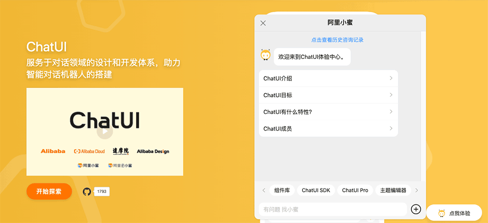
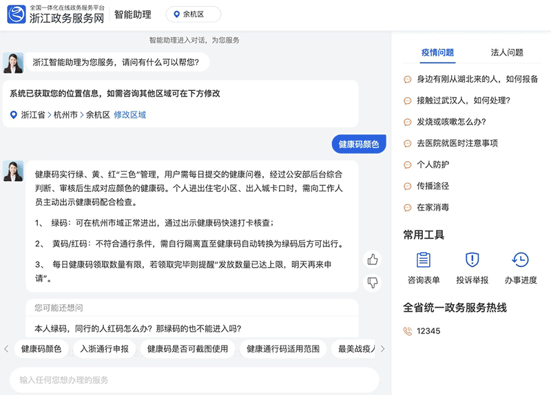
chatUI 适用于 React 项目,支持 PC/移动端样式响应式。效果如:
使用
在通过 Nodejs 包管理工具npm i @chatui/core安装完依赖后,只需在使用场景下引入对应模块即可。
<Chat/>组件
整个 ChatUI 的核心其实就是<Chat/>容器组件,然而在目前官方文档并没有对此组件的使用展开具体描述及案例说明,以致于需要经常查看其 ts 声明文件或 demo。个人的使用经验整理如下:
消息 hookuseMessages(initialState)
这是使用中关键且必不可少的 API,充当着控制器的角色,相关消息展示、修改等操作都是都过此 hook。文档上没有找到对应说明,从 ts 声明文件中可以大致了解其使用方法:
1 | export default function useMessages(initialState?: MessageWithoutId[]): { |
初始语句initialState
- 格式:
MessageWithoutId[],其中:1
2
3
4
5
6
7
8
9
10
11
12
13
14
15
16
17
18
19
20
21
22
23
24
25
26
27
28
29
30
31
32
33
34interface MessageWithoutId {
/**
* 消息类型
*/
type: string;
/**
* 消息内容
*/
content?: any;
/**
* 消息创建时间
*/
createdAt?: number;
/**
* 消息发送者信息
*/
user?: User;
/**
* 消息位置
*/
position?: 'left' | 'right' | 'center' | 'pop';
/**
* 是否显示时间
*/
hasTime?: boolean;
/**
* 状态
*/
status?: IMessageStatus;
/**
* 消息内容渲染函数
*/
renderMessageContent?: (message: MessageProps) => React.ReactNode;
}
如:
1 | import React from 'react'; |
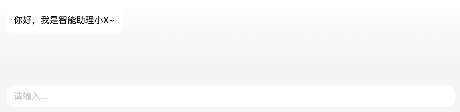
效果如:
也可以设置user属性增加头像:
1 | export interface User { |
如:
1 | const { messages, appendMsg } = useMessages([ |
效果如: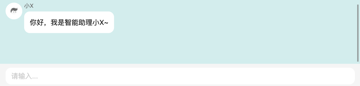
当然初始信息可以为多条、也可以为组件(设置type属性)
<Chat/>使用配置
如下图,官网对于<Chat/>容器的属性介绍非常简单,像navbar这些属性都不清楚具体配置项及示例
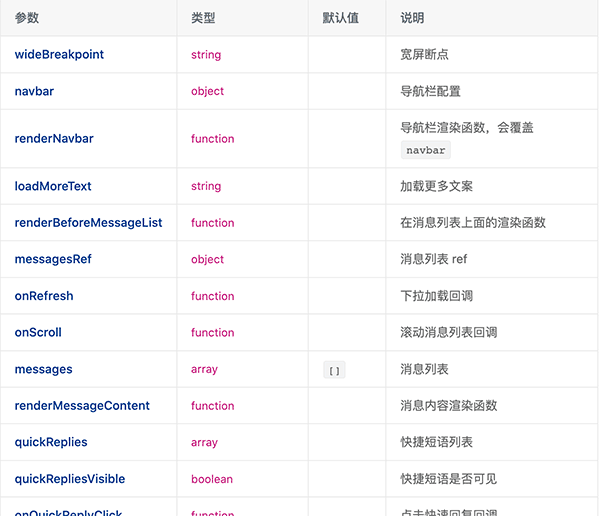
使用及配置时可以通过找到其声明文件来确定使用。还是以navbar为例,ts 声明如下:
1 | /** |
继续定位,可以大致猜测其作用
1 | export declare type NavbarProps = { |
再继续定位,如IconButtonProps:
1 | export interface IconButtonProps extends ButtonProps { |
以此基本能确定navbar配置项为:
1 | interface TempNavbarProps { |
组件
相比<Chat/>容器,其他组件的使用简单了很多。组件引入都在@chatui/core中,以使用频率最高的<Bubble>组件为例:
<Bubble>气泡
引入组件:
1 | import { Bubble } from '@chatui/core'; |
大部分的对话信息都会在<Bubble>中呈现,其属性type可以是字符串text、也可以是图片img。当然用得更多的形式是用<Bubble>包裹要展示的组件,如包裹卡片:
1 | <Bubble> |
效果如: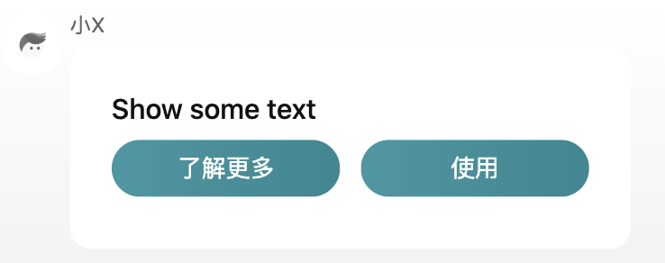
综合评估
能力
从本人个人使用来看还没有遇到能力不满足的情况,并且如果是计划做一套企业级对话系统的话可以尝试使用ChatUI pro
具体不做介绍
体积
从产物来看,chatUI 一共224kb的产物大小(css37k, js187k),整体来看也不算重
兼容性
支持响应式,从 css 来看无明显的兼容问题,应该能适配大部分设备。具体兼容情况待后续补充。
社区情况
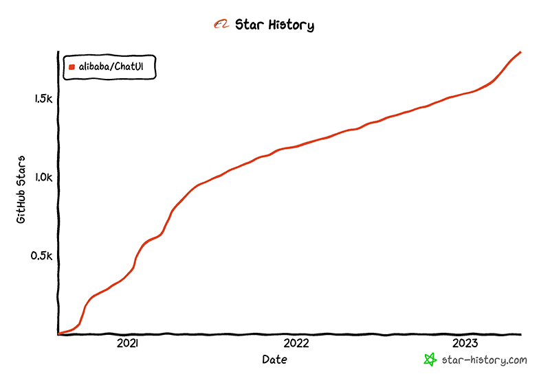
社区问题的处理看着不算很及时,项目看着也没有因近期 ChatGPT 而火爆。感觉文档及社区维护这块有提升的空间~
综合来看,ChatUI 是一种简单、易于使用的聊天应用程序 UI 设计。它的特点在于其简单、直观的设计,以及对多种消息类型的支持,问题在于当前的文档不够完善。
Author
My name is Micheal Wayne and this is my blog.
I am a front-end software engineer.
Contact: michealwayne@163.com