Moo-css

模块化面向对象思想的css写法规范策略。
M模块
Moo-CSS中的M(Module),模块化。Moo-CSS的模块化主要体现在样式属性的模块化以及样式层级的模块化两个方面。
样式属性分类
很多人都感觉,比起弱类型语言,强类型语言因为其严谨性特别在大型项目中会更容易维护。同样的,Moo-CSS将CSS样式属性进行分类,类似于底层变量使用,目的也是为了使项目具有更好的维护性。
根据样式属性的特征,Moo-CSS将样式属性分类样式划分为以下模块,并根据模块特征给定命名前缀(命名规则-标志前缀):
- grid:布局样式。布局、位置相关样式。如margin, position, line-height等;
- function:功能样式。文字居中、溢出隐藏等功能性样式。如clear, text-align, overflow, font-style, font-weight, font-family, vertical-align, white-space, text-decoration, text-indent等;
- unit:单元样式。宽高、padding等影响块或元素的常用单元样式。如width, height, padding, display, border, flex等;
- status:状态样式。透明度、是否隐藏、层级等显示状态样式(是唯一可设置!important的部分)。如visibility, opacity, z-index, transform等;
- skin:皮肤样式。主题颜色背景色等。如color, background-color, box-shadow等;
- animation:动画样式。过渡和动画。如animtaion, transition。
另外两种特殊模块:
- JavaScript DOM:DOM操作样式。供js操作DOM节点,建议不带有样式属性;
- React/Vue/Angular sepcial:框架独有样式。供专有框架使用,如过渡动画。
更多样式属性归类可参考样式模块词典>>
注意,Moo-CSS推荐其中 grid, module, unit, component, status, animation通常由类(className)选择器实现; skin通常由属性(attribute)选择器实现,*小程序通过className实现; function大部分由className实现,部分低权重样式由attribute实现。
使用className以及attribute来确认样式可以较好避免权重问题,且从中我们可以得知skin作为辅助样式而样式权重相比较低。Moo-CSS推荐避免ID以及!important进行样式开发,有且仅有一个!important样式用于元素隐藏(
.z-hide { display: none !important })。
如:
/* reset */
* {
    margin: 0;
    padding: 0;
    border: 0;
}
a,
a:hover {
    text-decoration: none;
}

/* module */
.m-menu {
    width: 100%;
    height: 100px;
    overflow-y: auto;
}
.m-menu .m-menu__item {
    heigth: 60px;
    line-height: 60px;
}

/* grid */
.g-pr {
    position: relative;
}
.g-mt10 {
    margin-top: 0.133rem;
}

/* function */
.f-unl {
    text-decoration: underline;
}
.f-ellipsis {
    white-space: nowrap;
    text-overflow: ellipsis;
    -o-text-overflow: ellipsis;
    overflow: hidden;
}
.f-tc {
    text-align: center;
}


/* unit */
.u-w10 {
    width: 10px;
}
.u-h10 {
    height: 10px;
}
.u-pt30 {
    padding-top: 30px;
}

/* component */
.u-btn {
    padding: 0;
    text-align: center;
    cursor: pointer;
    border-radius: 4px;
}
.u-win_bg {
    position: fixed;
    z-index: 18;
    top: 0;
    bottom: 0;
    left: 0;
    right: 0;
    width: 100%;
}
.u-icon-circle {
    width: 6px;
    height: 6px;
    border-radius: 50%;
}

/* status */
.z-hide {
    display: none !important;
}
.z-index_999 {
    z-index: 999;
}
.z-hide_60per {
    opacity: 60;
    filter: alpha(opacity=60);
}

/* animation */
.a-fadein {
    animation: fadein 1s 1 ease;
}
@keyframes fadein {
    from { opacity: 0; }
    to { opacity: 1; }
}

/* skin theme */
.s-bgc_red {
    background-color: red;
}

[s-cr_blue] {
    color: blue;
}
.u-icon-circle[s-big] {
    width: 60px;
    height: 60px;
}
样式分层
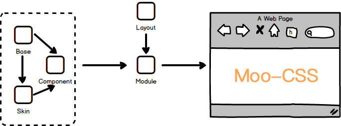
根据样式属性的特征,将项目样式分层为以下模块层级:
- Base:基础层。样式最底层,包含样式重置reset、提供样式变量及方法、供给极常出现的样式库。(通常所有页面共用且不做修改操作)。
- Component:组件层。包含样式组件和方法组件,简单组件样式。如按钮、蒙层;方法组件包括动画方法和mixins方法。可依赖于Base层和Skin层。
- Skin:皮肤层。设置颜色、背景色、屏幕媒体查询设置等皮肤,且提供项目独有颜色变量。常供应于Component层和Module层;
- Module:模块层。根据业务划分的模块,常作为Component的容器。依赖于上面几个模块以及Layout层;
- Layout: 结构层。提供Module层和其中的Component布局样式,构成最终页面。
其中,Base、Component、Skin、Layout中样式作用域为全局,Module层样式保持私有性。各层级保持独立性,满足SRP(单一功能原则)。
Base
基础样式层,它是整个业务开发中变动最小的模块层级,并且考虑多页面的缓存复用。Base层首先负责浏览器默认样式的重置、高频样式的输出、以及提供预处理工具颜色单位变量。如:
/*
 * base less demo
 */
// reset
* {
    margin: 0;
    padding: 0;
}
// common style
.f-tc {
    text-align: center;
}
.g-mt20 {
    margin-top: 20px;
}

// variates
@red: #f00;
Base层最为最底层,可供给其他各层的调用和匹配。并且由于Base为几乎所有项目共有,该层确立后便不建议进行删改、后续维护一般只作添加操作。更多Base层介绍及参考可访问moo-css-base >>
Base可包含的样式属性模块:reset、高频grid样式、高频function样式、高频unit样式、高频status样式、高频skin样式、component样式基础、颜色/尺寸变量(预处理工具)、高频mixins方法(预处理工具)。
Component
组件库层,可分为样式组件库和方法组件库,该层也考虑多模块或多页面间的缓存复用。这里包含着业务开发中可重复样式模块的最小单位和mixins方法。
样式组件库:
- 按钮、图标、蒙层等轻量样式等元件样式集合(标识前缀
u-),不涉及到grid布局样式。特别的,Moo-CSS推荐Component不写死width、height、font-size等样式,作为组件样式的核心单元(Component unit)保留组件特征。如下.u-btn, .u-btn_il,具有按钮组件的核心特征但不包含宽高颜色等样式,要展示具体样式需要其他层的配合; - 渐变过渡等动画样式集合(标识前缀
a-)。
方法组件库:
- 如下
.hh()mixins方法。
/*
 * component less demo
 */

// style
.u-btn,
.u-btn_il {
    text-align: center;
    border-radius: 4px;
    border: thin solid transparent;
}

// animation style
.a-fadein {
    animation: fadein 1s 1 ease;
}

// functions
.hh(@height) {
  height: @height;
  line-height: @height;
}
其.u-btn已具有按钮的核心特征:
Component可包含的样式属性模块:component样式、animation样式、mixins方法。
Skin
皮肤层,为Component或Module提供私有/公共皮肤样式。主要为字体、边框以及背景等颜色、特殊情况下Skin也包含button等组件约定尺寸和屏幕设备媒体查询样式。Moo-CSS推荐该层的选择器权重尽可能低(除Base-reset外最低),故推荐使用attribute属性选择器进行Skin样式开发。如:
[s-bgc_white] {
    backgound: #fff
}

[s-cr_red],
[s-color="red"] {
    color: red;
    background: rgba(255, 0, 0, 0.1);
    border-color: rgba(255, 0, 0, 0.3);
}

p[s-size="big"]{
    font-size: 30px;
    line-height: 2;
}
.u-btn_il[s-size="big"] {
    font-size: 18px;
    line-height: 2;
}
[s-type="default"] {
    border: thin solid #e2e2e2;
}
结合.u-btn可形成具体颜色的组件样式:
Skin推荐使用属性作为样式还避免了大量className导致HTML语意不直观,这样也让Skin变得更容易调整。(小程序环境目前不支持属性作为样式选择器,这种情况下Skin仍然需要使用className)
Skin可包含的样式属性模块:skin样式、项目颜色变量。
Module
模块层,如头、导航、菜单、列表等与业务息息相关,该层的样式灵活性较大但建议样式具有独立性。通常Module层作为Component的容器并确认Component的私有样式。Module命名可带有标识前缀m-,常用命名单词可采取缩略命名方式,可参考Module命名词典>>
如:
.m-login {
    padding: 20px;

    .login__btn {
        width: 65px;
    }
    .login__input {
        width: 30vw;
        .hh(30px);
    }
}
<section class="m-login f-tc" s-bgc_white>
    <p s-size="big">The login content</p>
    <p><input class="login__input f-tc g-fs20" placeholder="***" type="text" s-type="default"/></p>
    <p><button class="login__btn u-btn_il" s-color="red" s-size="big">login</button></p>
</section>
效果:
The login content
*很多时候容易分不清样式模块该归类于Component还是Module,以下有几条参考规则:
- 不能再细分下去的模块一定是Component,比如button或icon;
- 包含多个组件的样式模块基本是Module,比如login,它包含input和button组件;
- 与业务紧密相连的是Module,Component由其功能命名,与业务耦合较低。
Module可包含的样式属性模块:除skin/status/layout外的所有样式。
Layout
结构层,该层提供控制Module或Component在页面中的布局样式。简单样式可根据gird命名格式命名其className;与业务关联较大的复杂样式属性名同Module/Component。如:
.g-login {
    bottom: 1px;
    left: 0;
    right: 0;
    z-index: 2;
}
.g-mt20 {
    margin-top: 20px;
}
<section class="m-login f-tc g-pf g-login" s-bgc_white>
    <p s-size="big">The login content</p>
    <p class="g-mt20"><input class="login__input f-tc g-fs20" placeholder="***" type="text" s-type="default"/></p>
    <p class="g-mt20"><button class="login__btn u-btn_il" s-color="red" s-size="big">login</button></p>
</section>
Layout可包含的样式属性模块:grid样式、status样式。
最终通过Modules的拼凑形成最终的页面样式。
OO面向对象
Moo-CSS中的OO(Object-Oriented),面向对象。Moo-CSS的面向对象主要体现在Component和Module层。
2.1 组成
同OOCSS,Moo-CSS中的CSS对象由以下4部分内容组成:
- HTML,可以是DOM的一个或多个节点;
- CSS声明,关于这些DOM节点样式的CSS声明,其中部分CSS声明满足私立性;
- 资源组件,如背景图片,sprites等用于展示资源的;
- 事件,与对象关联的javascript行为、侦听器或方法。
这么说可能难以理解,简单来说VueJS/ReactJS/Angular项目中components目录下各单位为一个组件对象,views目录下各单位为一个模块对象。
可以看以下这个例子,它是一个vue组件(components/toast.vue),它包含着上述CSS对象的四个组成内容:
<!--
 toast
 -->
<template>
    <!-- 组件对象的HTML -->
    <transition name="va-toast f-tc g-fs24 g-lh150per g-pf">
        <div v-if="show" :class="[$style['u-toast'], $tyle['g-toast'], $style['z-' + type]]" s-bgc_white>
            <em class="u-icon_il u-icon-info" f-bg_cover></em>
            {{ message }}
        </div>
    </transition>
</template>

<script>
    export default {
        name: "toast",
        data () {
            return {
                show: true
            }
        },
        props: {
            type: {
                type: String,
                default: 'bottom'
            },
            message: {
                type: String,
                default: ''
            },
            show: {
                type: Boolean,
                default: false
            }
        },

        methods: {
            handleClose () {        // 组件对象的JavaScript事件
                this.show = false;
            }
        }
    }
</script>

<style lang="less" module>
/* 组件对象的CSS声明(私有) */
.u-toast {
    padding: 5px 7px;
    max-width: 80%;
    min-width: 30%;
    min-height: 18px;
    word-break: break-all;
    border-radius: 8px;
    -webkit-transform: translate(-50%, 0);
            transform: translate(-50%, 0);
}
.g-toast {
    z-index: 29;
    left: 50%;
}
.z-top {
    top: 10%;
}
.z-middle {
    top: 35%;
    font-size: 14px;
    line-height: 20px;
}
.z-bottom {
    bottom: 15%;
}
</style>

<style lang="less">
/* 组件对象的CSS声明 */

@import '~moo-css-base/mobileColors.less';

/*
 * v-toast
 */
.u-icon-info {
    background-image: url(../images/i-info.png);      // 组件对象的组件资源
}

.va-toast-enter-active,
.va-fade-toast-leave-active {
   -webkit-transition: opacity .5s;
   transition: opacity .5s;
}
.va-toast-enter,
.va-toast-leave-to {
  opacity: 0;
  z-index: -1;
}
</style>
可以理解,CSS对象中它的部分CSS声明需要有它的独立性,因此该组件便使用了css modules来保证.u-toast不受其他样式影响且不影响全局。
总得来说,就是满足SRP、OCP(开放封闭)。
2.2 OO特征
Moo-CSS的CSS对象也具备OO的三大特征,虽然并不明显。
2.2.1 封装
Moo-CSS的封装特性一方面体现在Module/Component中对象内容的封装,保持对象之间的独立性; 另一方面,各样式属性/方法的封装以及各样式层级的封装均体现了其封闭性。
2.2.2 继承
页面Module层/Component层可由其他Component层进行样式继承和拓展,各模块符合开闭原则(The Open/Closed Principle)
2.2.3 多态
Moo-CSS所说的多态一方面是指对应平台的多态样式/方法。比如moo-css-base移动端和PC端的Component层分别提供了rem换算方法torem,调用方式相同而移动端进行了1:75的单位换算,而PC端进行了1:54的单位换算。
至此Moo-CSS的概念基本在此已介绍完了,接下来将重点介绍Base层的确认使用以及命名规则。