const driver = new Driver({ className: 'scoped-class', // className to wrap driver.js popover animate: true, // Animate while changing highlighted element opacity: 0.75, // Background opacity (0 means only popovers and without overlay) padding: 10, // Distance of element from around the edges allowClose: true, // Whether clicking on overlay should close or not overlayClickNext: false, // Should it move to next step on overlay click doneBtnText: 'Done', // Text on the final button closeBtnText: 'Close', // Text on the close button for this step nextBtnText: 'Next', // Next button text for this step prevBtnText: 'Previous', // Previous button text for this step showButtons: false, // Do not show control buttons in footer keyboardControl: true, // Allow controlling through keyboard (escape to close, arrow keys to move) scrollIntoViewOptions: {}, // We use `scrollIntoView()` when possible, pass here the options for it if you want any onHighlightStarted: (Element) {}, // Called when element is about to be highlighted onHighlighted: (Element) {}, // Called when element is fully highlighted onDeselected: (Element) {}, // Called when element has been deselected onReset: (Element) {}, // Called when overlay is about to be cleared onNext: (Element) => {}, // Called when moving to next step on any step onPrevious: (Element) => {}, // Called when moving to next step on any step });
可注册回调事件:
1 2 3 4 5 6
onHighlightStarted: (Element) {}, // Called when element is about to be highlighted onHighlighted: (Element) {}, // Called when element is fully highlighted onDeselected: (Element) {}, // Called when element has been deselected onReset: (Element) {}, // Called when overlay is about to be cleared onNext: (Element) => {}, // Called when moving to next step on any step onPrevious: (Element) => {}, // Called when moving to next step on any step
// Prevents the current move. Useful in `onNext` or `onPrevious` if you want to // perform some asynchronous task and manually move to next step driver.preventMove();
// Gets the currently highlighted element on screen const activeElement = driver.getHighlightedElement(); const lastActiveElement = driver.getLastHighlightedElement(); activeElement.getCalculatedPosition(); // Gets screen co-ordinates of the active element activeElement.hidePopover(); // 关闭弹窗 activeElement.showPopover(); // 显示弹窗
activeElement.getNode(); // Gets the DOM Element behind this element
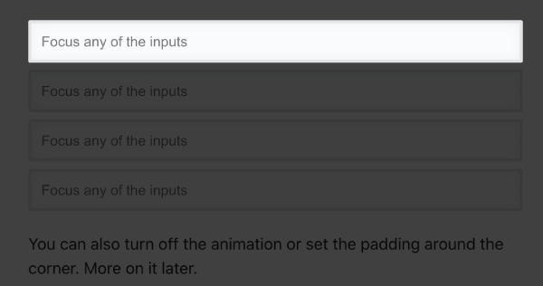
Input聚焦效果
我们希望在input获取焦点的时候也使用高亮的效果,则可如下:
1 2 3 4 5 6 7
const focusDriver = new Driver();
// Highlight the section on focus document.getElementById('creation-input') .addEventListener('focus', (e) => { focusDriver.focus('#creation-input'); });
效果-获取焦点:
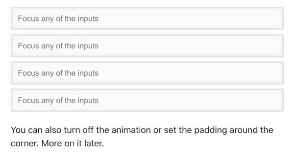
效果-失去焦点:
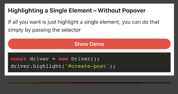
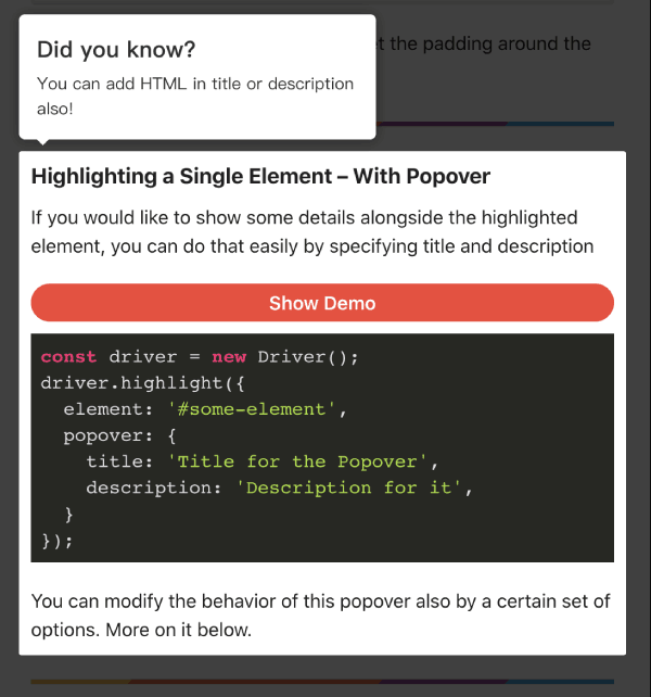
添加弹窗
如果希望增加引导弹窗,则可以添加popover属性,如:
1 2 3 4 5 6 7 8 9
const driver = new Driver();
driver.highlight({
  element: '#some-element',
  popover: {
    title: 'Title for the Popover',
    description: 'Description for it',
    position: 'left'
  }
});
Author
My name is Micheal Wayne and this is my blog.
I am a front-end software engineer.
Contact: michealwayne@163.com